Many presenters use decks or slides to support their presentations. When presenting, you might decide you need a deck to guide your discussion. Slides can be useful in face-to-face meetings, and they're certainly required for virtual meetings. But designing them is not as simple as slapping some content and pictures into presentation software like PowerPoint or Keynote.
This article covers how to design effective presentation slides. Before reading what makes a good presentation deck, you'll review what makes a bad one.
What can go wrong with presentation slides?
Several things can go wrong with your deck. Common problems include the following:
- Complicated diagrams
- Too many bullet points
- Lack of white space
- Small, unreadable fonts
- Slides that list everything the presenter says
- Distracting animations
How can you ensure that your slides are not riddled with these problems?
Help Rodrigo design his presentation
Rodrigo is working on a presentation about the Titanic, but each slide he's worked on so far has a specific problem. Your task is to identify what's wrong with the slides and help him fix his presentation deck.

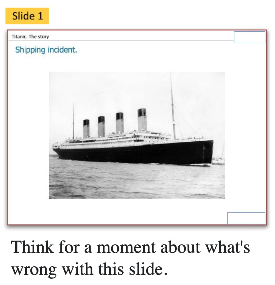
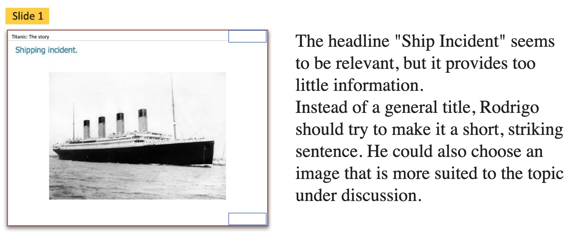
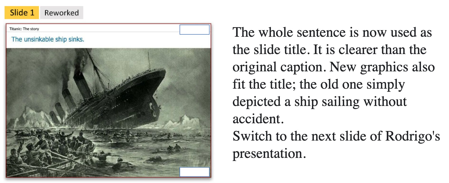
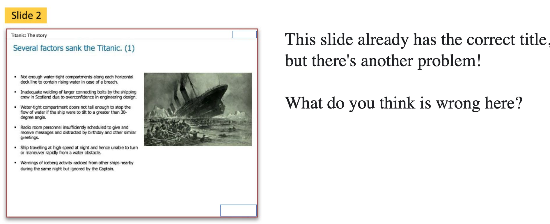
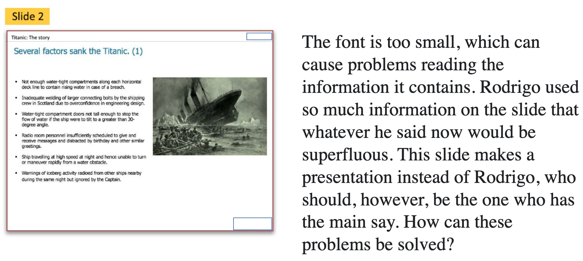
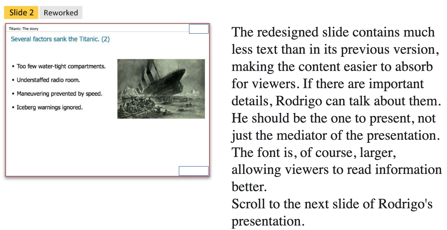
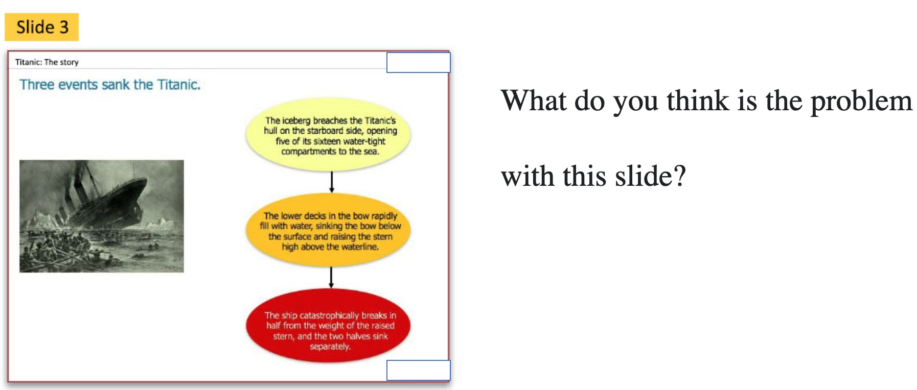
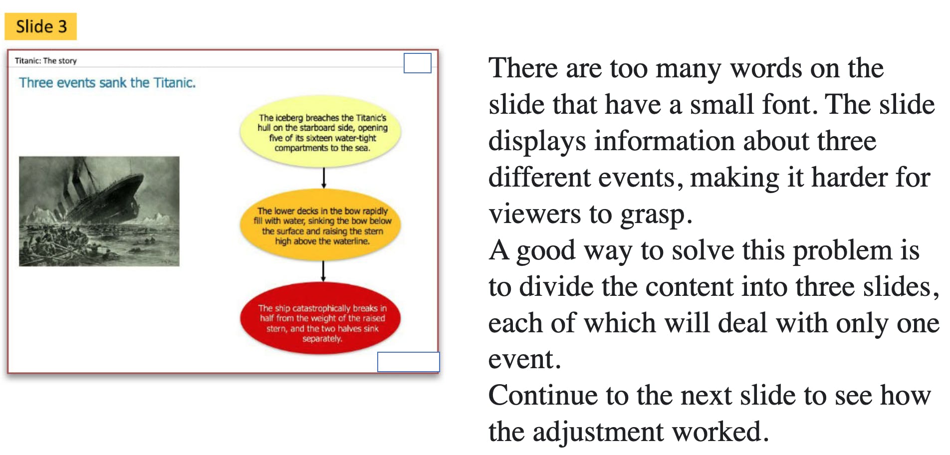
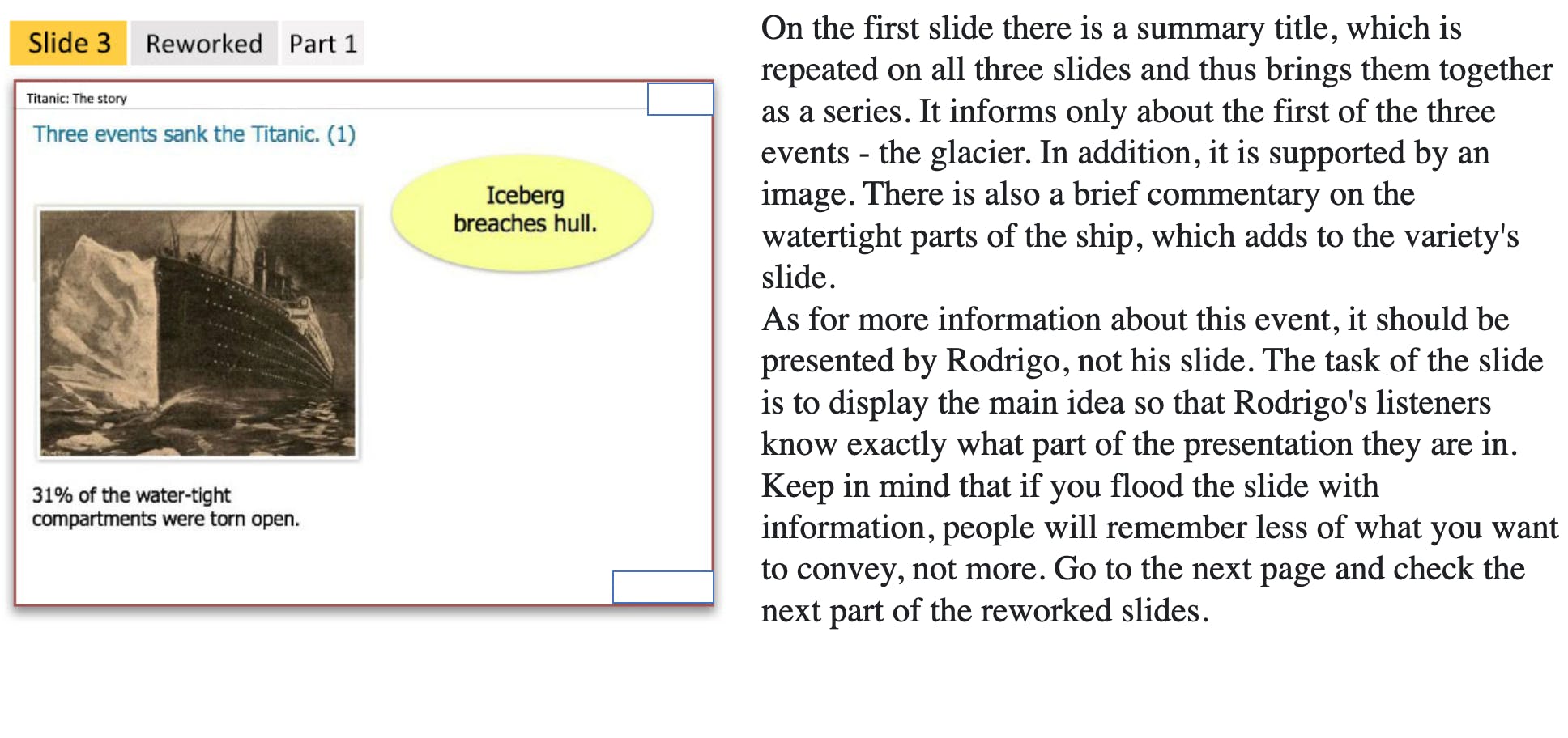
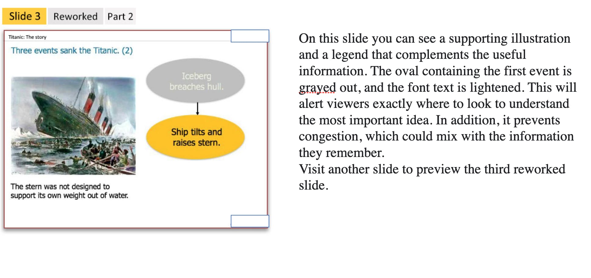
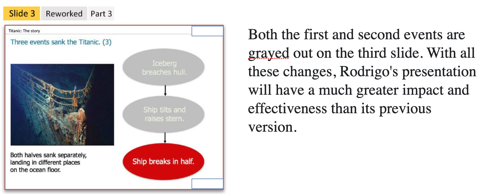
Summary of changes that helped transform Rodrigo's presentation
How did Rodrigo treat this content so the learner can't preview it?
He turned his headings into full-sentence headlines. He split the ideas into a three-part sequence—like a little movie. And, he cut the text down to just the key ideas. Now the slides will support Rodrigo while he delivers his message, and they'll help people remember his presentation rather than becoming overwhelmed and tuning out.
Rodrigo did these things to improve his slides:
- Turned headings into headlines
- Used relevant graphics
- Showed key ideas on the slide
- Split complex content over multiple slides
- This is particularly important when you're presenting online: Don't be afraid to create a larger number of slides that remain on the screen for a shorter time.
If you use the slides to add small bits of information at a time, using color and gray-scale, your audience always knows where to look. You'll hold their attention much more effectively. This brings up an important question ...
Should you distribute your deck to your audience?
Slide decks are for presenting, not for reading. Sharing them causes you to overload your audience with information, which can detract from your presentation and their focus on you as the presenter. Avoid sharing your presentation.
Instead, you can do one of two things:
- Write up your findings in a short white paper illustrated with just a few key graphics from your slides, and share that with your audience.
- Or, if you don't have the time to create a white paper, then cut your deck down, removing all the build and transition slides so that just your key points remain. Share that cut-down version.
Whichever you choose, resist the temptation to distribute your presentation slides so people can print them out. By the time you've made them work for information sharing, you'll have altered them too much for effective presentation.
Key learning points in this topic
Follow these tips for designing effective presentation decks:
- Use headlines or complete sentences as titles.
- Use relevant images.
- Avoid too much text.
- Use a readable font size.
- Break complex diagrams into multi-slide builds.
- Share a white paper, listing your key points.
